

How to Create Effective Data Dashboards: A Step-by-Step Guide
How to create effective data dashboards is one of the most critical skills In today’s data-driven world, we’re drowning in information but starving for insights. Every day, businesses, organizations, and individuals generate massive amounts of data, but without effective visualization, this valuable resource remains largely untapped. Enter data dashboards powerful visual interfaces that transform raw numbers into compelling stories that drive decisions and inspire action.
As someone who has spent years helping organizations turn their data into visual narratives, I’ve seen firsthand how well-designed dashboards can revolutionize the way teams operate. Whether you’re a business analyst, a marketing professional, or simply someone looking to make sense of complex information, this comprehensive guide will show you exactly how to create effective data dashboards that tell compelling data stories and drive real business results. If you’re interested in how data dashboards can enhance your business, check out our Dashboard Design Services.
Why Data Visualization Matters in Effective Dashboard Creation
Before diving into dashboards specifically, let’s understand why data visualization is so crucial in today’s landscape:
The Human Brain is Visual: We process visual information 60,000 times faster than text. A well-designed chart can communicate a trend in seconds that might take paragraphs to explain.
Data Volume is Exploding: Global data creation has reached about 2.5 quintillion bytes daily. Visualization helps us make sense of this overwhelming volume.
Decision Speed is Critical: In competitive environments, the ability to quickly understand data and make informed decisions can be the difference between success and failure.
Complex Relationships Need Context: Data rarely tells its story in isolation. Visualization helps reveal patterns, correlations, and outliers that might otherwise remain hidden.
Now, let’s explore how dashboards bring these benefits together in a unified visual interface.
What Makes Data Dashboard Effective?
A dashboard is far more than just a collection of pretty charts. An effective dashboard:
- Answers specific questions that matter to its audience
- Prioritizes information to highlight what’s most important
- Provides context through comparisons, targets, and historical data
- Tells a coherent story with a logical flow between related metrics
- Enables action by making clear what needs attention
Think of a dashboard as a visual narrative. Just like any good story, it needs a clear purpose, a logical structure, compelling characters (your data points), and a satisfying conclusion (actionable insights).
Step-by-Step Process for Designing Effective Data Dashboards
Creating an effective dashboard is a journey that begins long before you choose colors or chart types. Here’s a structured approach:
1. Define the Purpose and Audience
Every great dashboard starts with a clear purpose. Ask stakeholders:
- Who will use this dashboard?
- What decisions do they need to make?
- What questions do they need answered?
- How often will they reference this information?
A sales director needs different information than a marketing specialist or a product manager. Understanding your audience shapes everything that follows.
2. Identify Key Metrics and Dimensions
Once you understand your audience’s needs, determine which metrics matter most. Resist the temptation to include everything dashboards become less effective as complexity increases. For each metric, consider:
- Is this directly related to the dashboard’s purpose?
- Will this help the user make a specific decision?
- Does this provide unique insight not covered by other metrics?
Also identify key dimensions for analysis:
- Time periods (day, week, month, year)
- Categories (products, regions, customer segments)
- Channels (marketing sources, sales teams)
3. Choose the Right chart Types
Different metrics call for different visualisation types. Here’s a quick guide:
Time Series Data (showing change over time):
- Line charts for continuous trends
- Bar charts for discrete time periods
- Area charts for cumulative values
Part-to-Whole Relationships:
- Pie or donut charts (use sparingly and only for 3-7 categories)
- Stacked bar charts
- Treemaps for hierarchical data
Comparisons Between Categories:
- Bar charts (horizontal bars work best for long category names)
- Bullet charts (for comparing actual vs. target)
- Heatmaps for showing intensity across categories
Distributions:
- Histograms for frequency distributions
- Box plots for showing statistical properties
- Scatter plots for showing relationships between variables
Single Metrics and KPIs:
- Number cards with trend indicators
- Gauge charts (use sparingly)
- Progress bars for completion metrics
Remember: The simplest chart that effectively communicates your data is usually the best choice.
4. Create an engaging Layout
Dashboard layout should follow a natural reading pattern (typically left-to-right, top-to-bottom) and group related information together.
Organisational Principles:
- Place high-priority information in the upper left
- Group related metrics together
Common Layouts:
- Z-Pattern: For dashboards with sequential information
- F-Pattern: For dashboards with multiple sections
- Quadrant Layout: Organising by importance and urgency
5. Use a clean Design
While aesthetics shouldn’t overshadow function, thoughtful design enhances comprehension:
Color Usage:
- Use color consistently and Limit your palette to 2-3 base colors
- Ensure sufficient contrast for readability
Typography:
- Use a consistent, readable font
- Avoid excessive text on dashboards
Empty Space:
- Don’t fear white space, it improves focus and reduces cognitive load
- Resist the urge to fill every pixel with data
Top Visualisation Tools for Creating Effective Dashboards
Modern dashboard tools have dramatically lowered the barrier to entry for creating professional visualizations. Here’s a breakdown of popular options:
Tableau Public (Free)
- Highly intuitive drag-and-drop interface
- Limited to public data only in free version
- Extensive visualization options
Microsoft Power BI (Free tier available)
- User-friendly for Excel users
- Excellent Microsoft ecosystem integration
- Free desktop version with basic features
Looker Studio (Previously Google Data Studio)
- Enhanced functionalities beyond Data Studio
- Free for basic use
- Better database connections
Common Dashboard Mistakes to Avoid
Even experienced designers can fall into these traps:
1. Cluttered Overload
- Problem: Cramming too many metrics onto one screen
- Solution: Focus on what’s truly important; create separate dashboards for different purposes if necessary
2. Poor Visual Hierarchy
- Problem: Everything competes for attention equally
- Solution: Use size, position, and color to guide the eye to what matters most
3. Misleading Visualizations
- Problem: Charts that distort data relationships (like truncated axes)
- Solution: Always prioritize accuracy over visual impact
4. Inconsistent Formatting
- Problem: Different date formats, number formats, or terminology
- Solution: Create and follow standards for all dashboard elements
5. Ignoring Context
- Problem: Showing metrics without comparisons or targets
- Solution: Always provide context through historical data, benchmarks, or goals
Conclusion: Turning Data into Decisions with Effective Dashboards
In an age where data is abundant but insight is precious, the ability to create effective dashboards is increasingly valuable. Remember that the ultimate purpose of any visualization is not just to inform, but to enable better decisions.
Great dashboards transform numbers into narratives, statistics into strategies, and data points into decisive action. They make the complex comprehensible and the abstract actionable.
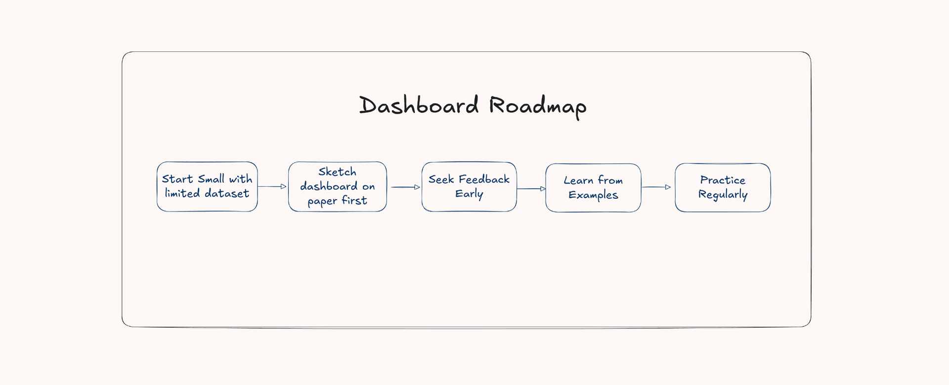
Remember, creating effective data visualizations is both an art and a science. The technical skills matter, but equally important is developing an eye for what makes data meaningful and memorable. Keep practicing, stay curious, and your dashboards will continue to improve with each iteration.
Whether you’re a data professional, a business leader, or simply someone trying to make sense of information, I hope this guide helps you create visualizations that don’t just present data, but truly tell its story.